
EatWhere?

A multiplayer, no-login web app that settles where a group should eat. One person shares a code, everyone votes from their own phone, and the app reveals a winner with real restaurants nearby.

Try eatwhere.app
Type
Side project
Platform
Mobile-first web
Role
Product, design and build
Status
Live at eatwhere.app
  1. Blame

    If you pick and the food is bad, it’s your fault, so the default is “anything is fine” and nothing gets decided. EatWhere? hands the call to the group vote, then to the algorithm. It’s nobody’s fault.

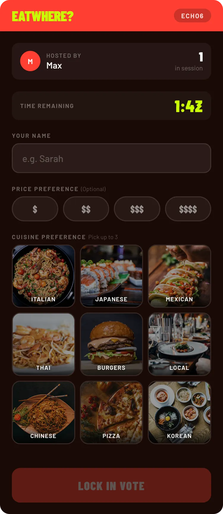
    Voting screen: a grid of cuisines with price filters.
  2. Friction

    Anything that needs an account, a download or more than 30 seconds to explain loses to the WhatsApp thread. The bar isn’t “better than other apps”. It’s “better than the group chat”.

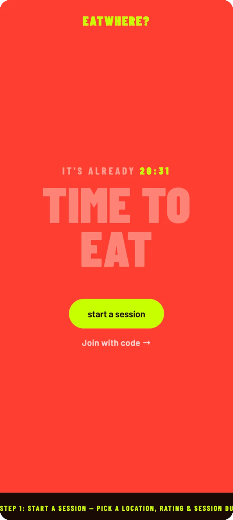
    Landing screen: “Time to eat” with a single Start a session button.
  3. Commitment

    Most group-decision tools surface a list and leave the hard part to the group. EatWhere? ends with a winner, announced to everyone at once, with real restaurants ready to tap.

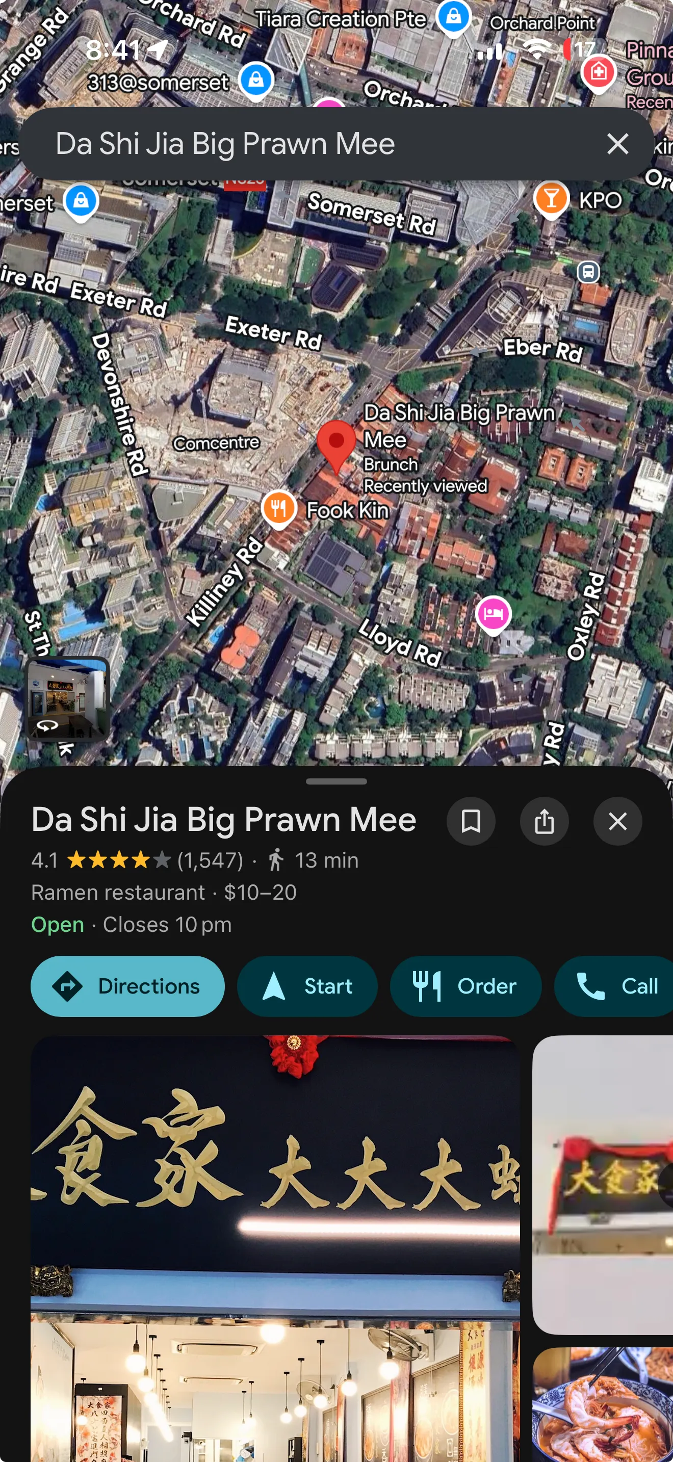
    The winning restaurant opened in Google Maps, ready for directions.

What mattered, and why

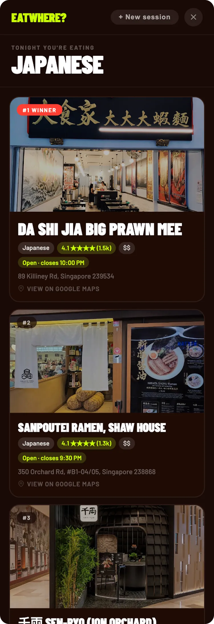
The reveal: a countdown, then the winner for the whole group: Tonight you’re eating Japanese, with the top restaurant.

The reveal is the product

Most group-decision tools end with a list. EatWhere? ends with a moment, and everything before it is build-up. The reveal has three states.

  • A clear winnerShown large and theatrically, to the whole group at once.
  • A tieA slot-machine spin before it lands on one winner.
  • No votesA random pick, with a message saying so.

“I spent more time designing that 3-second screen than anything else in the product.”

Zero friction, non-negotiable

No account and no app store: a name, a four-character code and a shared link. If the product adds a step, it loses to the group chat. The landing page does one job: Start a session, with join-with-code beneath it, and nothing asks you to sign up. Sessions are single-use and stateless; nothing persists after the reveal.
Participants first

Nine in ten people in a session only see four screens: join, vote, confirm and reveal. The host dashboard matters, but later. V1 was built entirely around getting the participant loop right.

The participant journey

Voting is the core interaction. Pick up to three cuisines from a 3×3 grid, each card a photo, emoji and name; once three are chosen, the rest dim. The button names the choice: “Vote for Japanese”, or “Vote for Italian · Thai”.

  1. Vote: Up to three cuisines, price range and dietary needs.

    Vote Up to three cuisines, price range and dietary needs.

  2. Reveal: The winner, announced to the whole group at once, with up to three nearby restaurants ready to tap.

    Reveal The winner, announced to the whole group at once, with up to three nearby restaurants ready to tap.

  3. Restaurant: Opens straight in Google Maps.

    Restaurant Opens straight in Google Maps.

The host journey

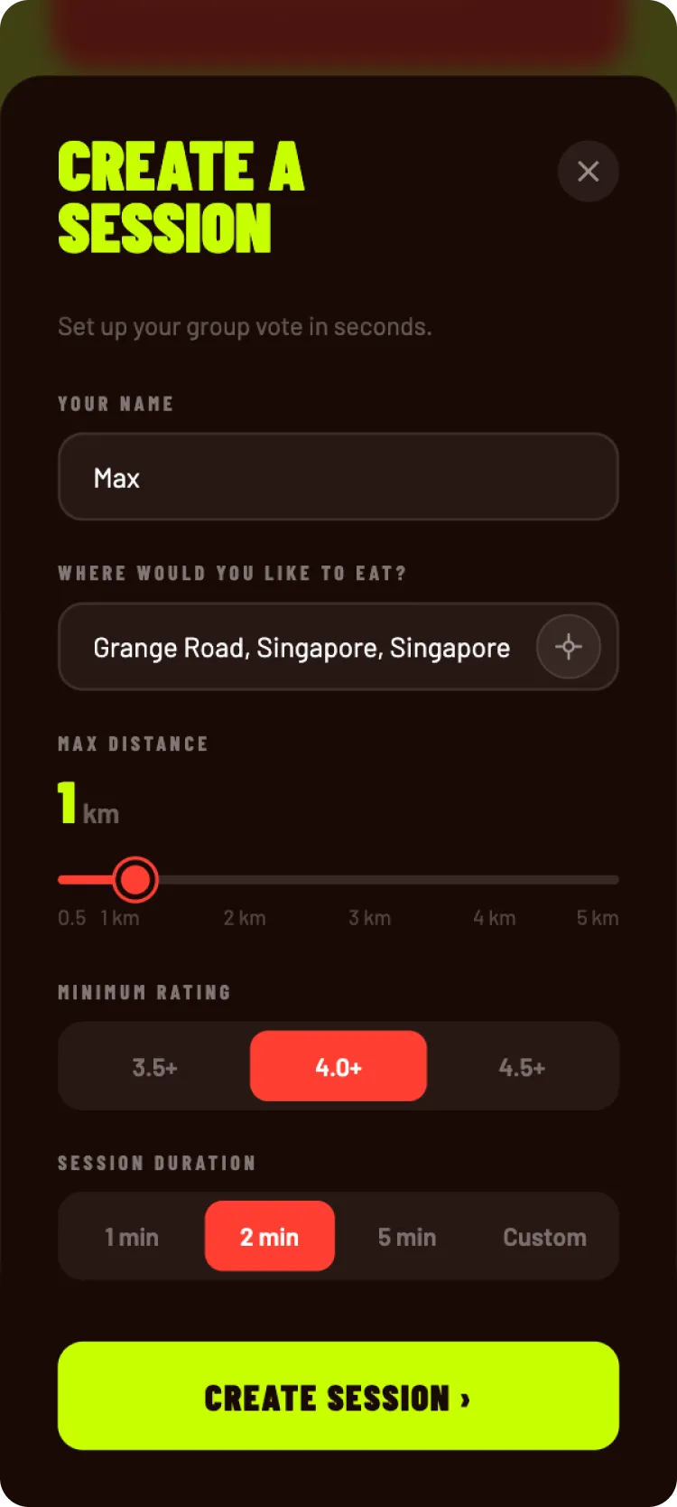
Create a session: name, location, max distance, minimum rating and session duration.

Set up in seconds

  • LocationFree text with autocomplete (Nominatim), or detect by GPS.
  • Distance0.5, 1, 2 or 5 km: the search radius for results.
  • Minimum rating3.5+, 4.0+ or 4.5+, so weak options never reach the reveal.
  • Session length1, 2 or 5 minutes, or custom, with a countdown everyone sees.
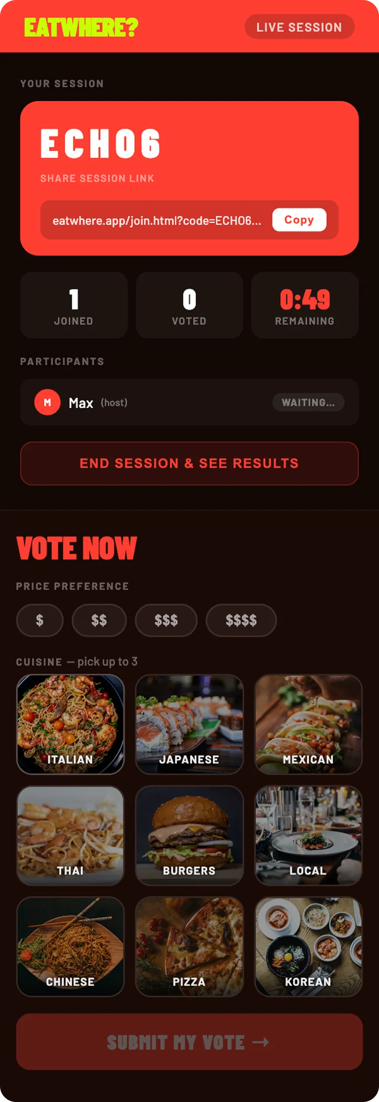
Host dashboard: session code and link, joined, voted and time remaining, participants, and the host’s own vote.
  1. Running the session

  2. Session code

    Four characters, shown large, with the full invite link and a copy button. No O, I, 0 or 1, so nobody misreads it.

  3. Live stats

    Joined, voted and a countdown, updating in real time without a refresh.

  4. Participants

    Everyone’s name with a waiting or voted badge.

  5. The host votes too

    Same voting UI as everyone else, which disappears once the host has voted.

Results: the winning cuisine and the top three nearby restaurants with ratings, price and opening hours.

Completing the journey

  • Live queryFetched live from Google Places the moment the session ends, not cached, using the winning cuisine, price, dietary needs, radius and rating.
  • Restaurant cardThe top result is highlighted as the pick. Each card shows photo, rating, reviews, price, open status, distance and dietary tags where available.
  • Hand-offAny card opens in Google Maps. EatWhere? makes the decision, then gets out of the way.
  • Never emptyIf nothing matches exactly, the search widens and a banner explains why.

Finding the right tone

V1, AI-led

The AI proposed almost the whole visual direction, with light direction from me. The structure validated quickly, but it felt dated in front of real users. I’d let the tool lead too much.

V2, intent-driven

I started from references and a defined energy, and asked for distinct directions, not variations. A dark, moody option was too busy for a 30-second experience; the bold, high-contrast one won. I shipped it knowing it wouldn’t please everyone: bold condensed capitals in red and lime. Warm, not fast food. Playful, not childish.

Directing AI as a build tool

The whole product was designed and coded with Claude. No engineers, no agency: brief, flows, UI and front-end code, all directed through AI with me making the calls. It isn’t a story of AI doing the work. It’s about directing it, building judgment along the way, and being honest about where it broke down.

  • What workedSpeed from zero to something testable. Product logic and visual structure validated in hours, not weeks.
  • Where it broke downDrift grows with how loosely you direct it. Be as precise with AI as with a junior designer, more so, because it won’t tell you when it’s guessing.
  • What I’d do differentlyVersion the code from day one: without it, the V2 redesign was a full rebuild. Write the brief before building, and direct the AI systematically from the start.
  • Next timeThe question isn’t which AI is best, but which is right for which job: local models for boilerplate, cloud models for reasoning-heavy work. One provider for everything isn’t optimal architecture; it’s convenience.

Hiring, or have a product that needs simplifying?

Tell me about the role or the project.